Stephen Marsh
Building brand consistency for an established freelance copywriter, from social media avatar to project proposals.


Evolving a disjointed brand identity and website.
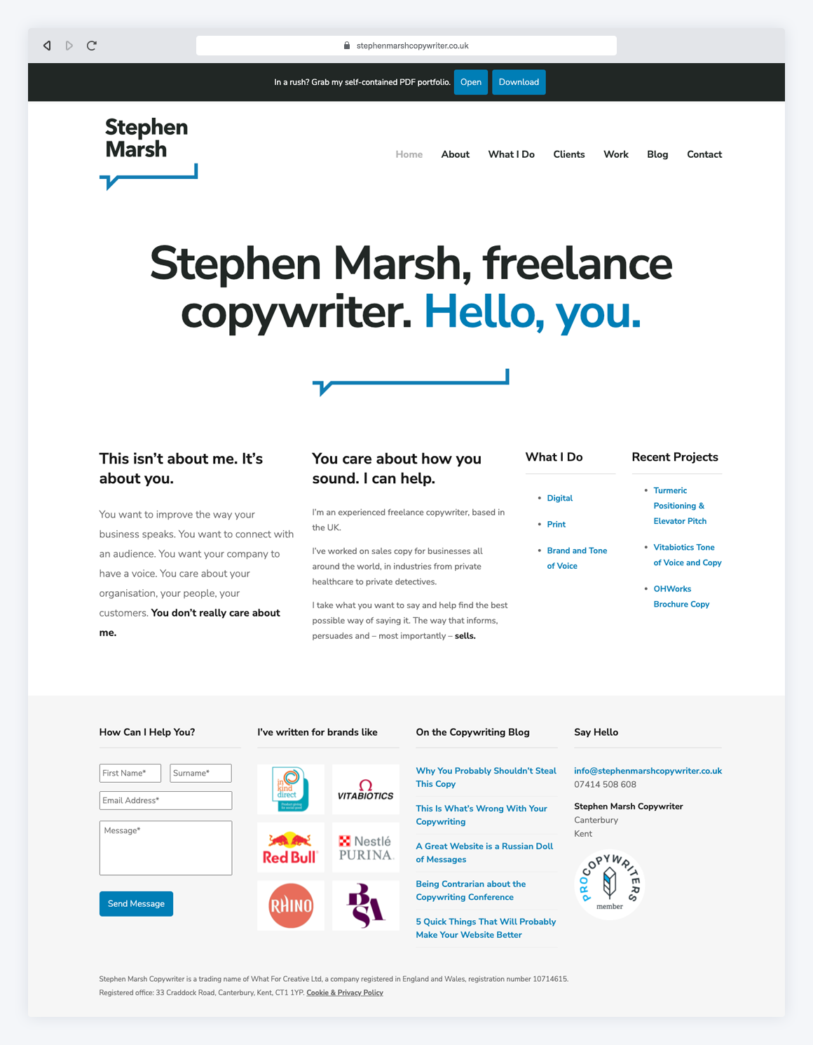
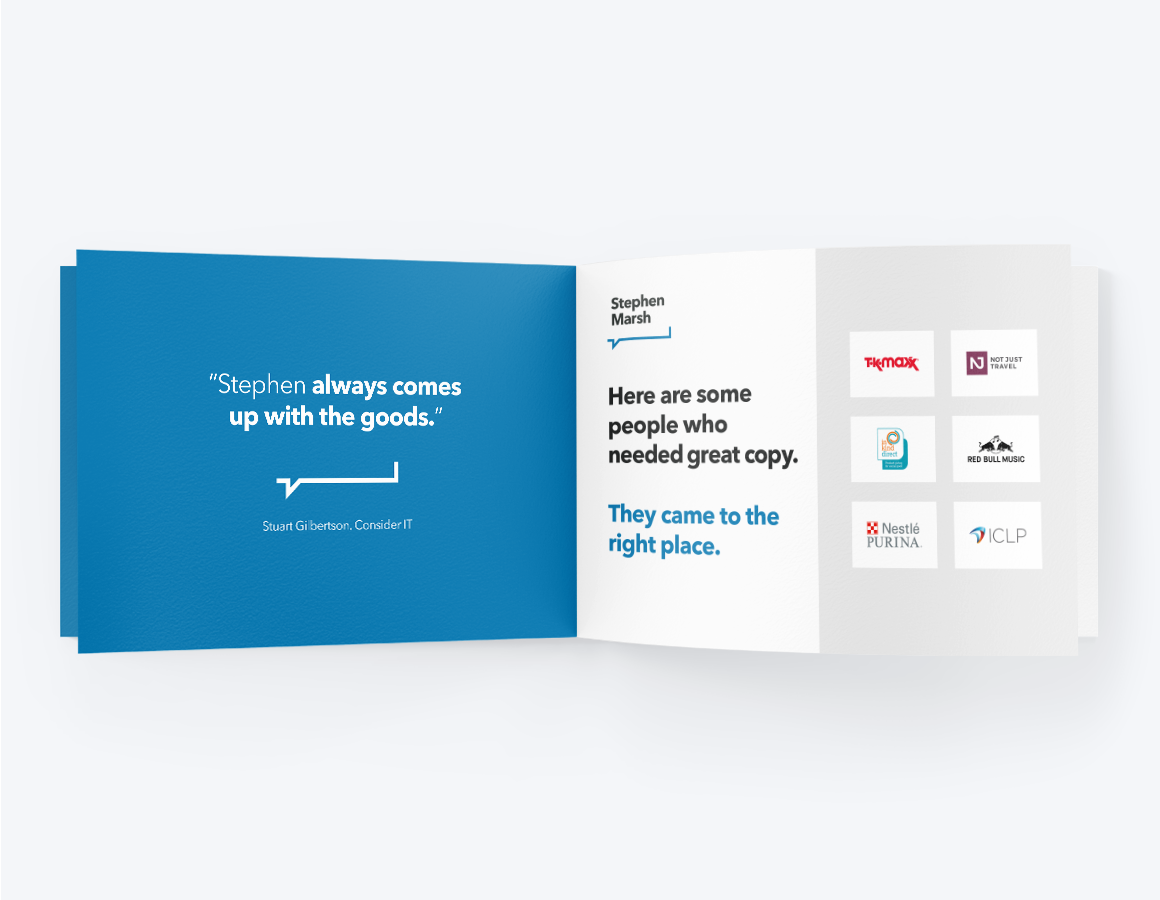
After a decade of being in business, Stephen’s website and identity had grown, changed and evolved. But this led to a disjointed, sometimes confusing mix of visual elements and documents that had been thrown together for everything from proposals to pitches.
Stephen needed a visual style for his logo, website and documents, to bring consistency to his marketing.
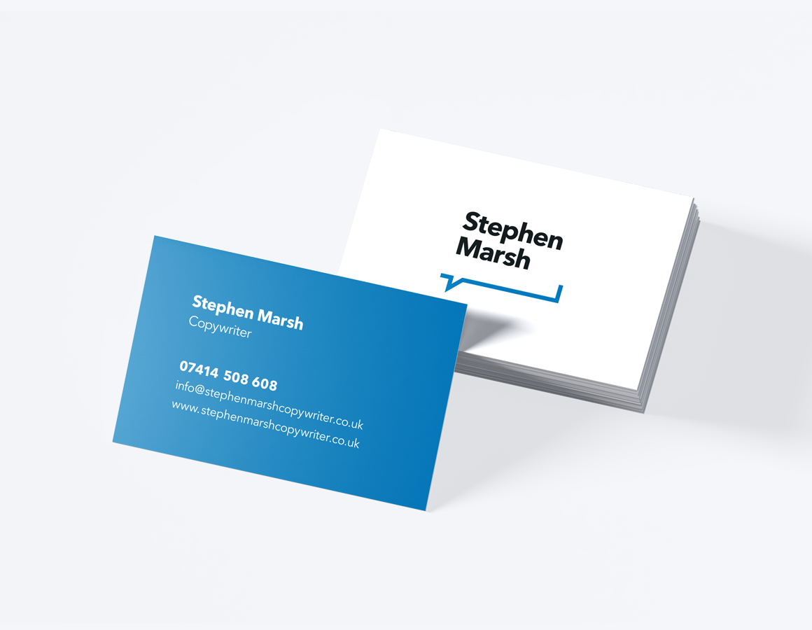
We developed simple brand guidelines, helping to make the visuals as coherent as the copy. The logo device is just one example – an evolved, refreshed take with a clean line that brings every piece of collateral together while adding a spark of personality.
Post-rollout, Stephen received positive feedback from new and existing clients who felt the design was ‘a better reflection of who you are and what you do’.
What we did
Logo / Brand identity
Print Design
Web Design
Website
stephenmarshcopywriter.co.uk
Stephen says:
“Designing for a copywriter is hard, but Greg gets it. There’s no ego in the room, just someone who listens to what’s important to you, then takes that to a new level with his own know-how. I try to let the copy do the talking, but my clients are all discerning when it comes to design. And they love this.”
– Stephen Marsh, Copywriter